

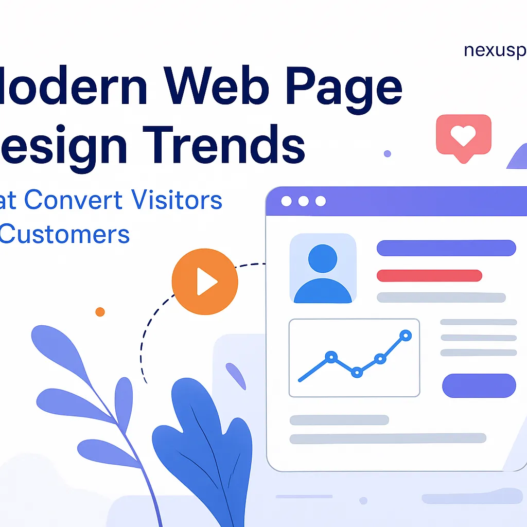
Modern Web Design: Convert Customers with Top Trends
Introduction
Welcome to the digital playground where modern web page design is not just a trend it's a necessity! In an era where attention spans are shorter than a cat video, having a website that captivates and converts is more crucial than ever. Think of your website as the front door to your business; if it’s not inviting, potential customers might just walk right past it.
But what does "modern" really mean in the context of web page design? It’s about creating experiences that resonate with users while driving them towards action. We're talking about everything from responsive web design that looks great on any device to slick UI design that makes navigation feel like a breeze. In this post, we’ll dive into the latest trends and techniques that can transform your online presence from “meh” to “wow!”
Let’s face it, in today’s competitive landscape, simply having a website isn’t enough. You need one that embodies best practices in user experience design (UX), harnesses the power of HTML5 and CSS3, and embraces cutting-edge features like parallax scrolling effects. So buckle up as we explore how you can leverage these trends to turn casual visitors into loyal customers!

Understanding Modern Web Page Design
Modern web page design is like the Swiss Army knife of the digital world it’s versatile, essential, and can transform a simple website into a customer-converting machine. But what exactly does this mean? Let’s break it down.
Definition of Modern Web Page Design
At its core, modern web page design emphasizes functionality, aesthetics, and user engagement. It’s about creating an online experience that not only looks good but also works seamlessly across all devices. Think responsive web design that adapts to any screen size, from desktops to mobile-friendly websites.
Importance of Design in the Service Industry
In the service industry, where competition is fierce and first impressions matter (a lot), modern web page design becomes even more crucial. A well-designed website can:
Enhance User Experience (UX): Great UX design ensures users find what they need quickly and easily.
Boost Credibility: A professional-looking site builds trust with potential customers.
Increase Conversions: Effective UI design with clear call-to-action buttons can turn visitors into loyal customers.
Did you know? According to recent studies, users form an opinion about your website within just 50 milliseconds! That’s faster than you can say “responsive web design.”
The Evolution of Web Development Trends
The landscape of modern web page design is constantly evolving. Here are some key trends shaping how we create and interact with websites today:
Minimalist Web Design: Less is more! Clean layouts with ample white space help users focus on what matters.
Flat Design: This trend favors simplicity and functionality over ornate graphics think sleek interfaces that load faster.
Interactive Web Elements: Incorporating micro-interactions keeps users engaged. For instance, animated buttons or hover effects make browsing fun!
Diverse Color Schemes: The right color schemes for websites can evoke emotions and drive action. Choose wisely!

A Focus on Accessibility and Compatibility
A key aspect of modern web page design is ensuring that your site is accessible to everyone. This means implementing techniques for website accessibility so that all visitors, regardless of their abilities, can navigate your site easily. Additionally, cross-browser compatibility ensures your website looks great on every platform from Chrome to Safari!
Catering to diverse audiences through accessibility techniques not only broadens your reach but also enhances user satisfaction.
The bottom line? Embracing these elements in your modern web page design strategy will not only enhance user experience but also drive conversions in the service industry. So roll up those sleeves and get ready to create a website that captivates and converts!
Key Elements of Responsive Web Design
When it comes to modern web page design, responsive web design is like the Swiss Army knife of the digital world. It’s essential for creating websites that not only look good but also function seamlessly across various devices. Let's dive into the key elements that make responsive design a must-have in today's web development trends.
Mobile-Friendly Websites
With over half of all web traffic coming from mobile devices, your website needs to be mobile-friendly. Think of it as making sure your favorite restaurant has a takeout option if they don’t, you might just go hungry (or in this case, lose potential customers). A mobile-friendly site adjusts its layout and content to fit any screen size, ensuring users have a pleasant browsing experience.
Adaptive Web Design Techniques
Adaptive web design takes things up a notch by detecting the user’s device and serving them a tailored layout. This is like having a personal shopper who knows your style and only shows you clothes that fit perfectly. With adaptive techniques, you can create multiple layouts for different screen sizes, ensuring that your website aesthetics remain consistent and appealing.
Responsive Images in Web Design
No one likes waiting for images to load it's like watching paint dry! Responsive images automatically adjust their size based on the device's screen resolution. This not only speeds up loading times but also enhances user experience design (UX) by ensuring that visuals are crisp and clear on all devices.
Grid Layout Design
A grid layout is the backbone of responsive web design. It organizes content in a clean, structured manner that adapts to different screen sizes. Imagine it as the framework of a house without it, everything would just fall apart! Using CSS Grid or Flexbox can help you achieve this flexible structure while maintaining visual hierarchy on your pages.
Website Accessibility
Responsive design isn’t just about aesthetics; it's also about making your site accessible to everyone, including those with disabilities. Implementing accessibility features ensures that all users can navigate your site easily, which is not just good practice it’s also often required by law!
Takeaway: Embracing responsive web design elements is crucial for modern web page design. Not only does it enhance user experience and accessibility, but it also boosts SEO rankings by keeping visitors engaged longer on fast-loading websites.
 displaying the same website layout responsively")
User Experience (UX) and User Interface (UI) Design Principles
Alright, let’s dive into the delightful world of UX and UI design! Think of UX as the friendly guide that ensures users enjoy their journey through your website, while UI is like the chic outfit that makes sure everything looks fabulous. Together, they create a modern web page design that not only attracts visitors but also converts them into loyal customers.
User Experience Design Fundamentals
The key to successful user experience design lies in understanding your audience. You need to know what makes them tick! Conduct user research to gather insights about their needs and frustrations. From there, you can create user personas that help shape your design decisions. Remember, a well-designed experience is like a great story it should be engaging, intuitive, and easy to follow.
Visual Hierarchy in Web Pages
Have you ever walked into a room and immediately noticed the stunning chandelier? That’s visual hierarchy at work! In modern web page design, it’s about guiding the user's eye to what matters most. Use size, color, and spacing strategically to highlight important elements such as headlines, images, and call-to-action buttons. This not only enhances aesthetics but also improves usability.
Pro Tip: Utilize grid layout design to maintain a clean structure while allowing flexibility for creative expression. This helps achieve balance in your website aesthetics.
Website Navigation Best Practices
Navigating a website should be as effortless as gliding down a water slide on a hot summer day! Here are some best practices:
Keep it simple: Limit menu items to avoid overwhelming users.
Use descriptive labels: Clear labels help users understand where each link will take them.
Implement breadcrumbs: These little navigational aids show users where they are within your site.
Make it accessible: Ensure navigation is usable for everyone by considering website accessibility guidelines.
Responsive Web Design Considerations
Your modern web page design must be responsive! With more people browsing on mobile devices than ever before, ensure your site adapts beautifully across all screen sizes. Use HTML5 and CSS3 techniques for flexible layouts and responsive images that enhance user experience on any device.

In conclusion, mastering UX and UI principles can transform your website from just another online presence into an engaging platform that captivates visitors. By focusing on user needs, establishing visual hierarchy, simplifying navigation, and embracing responsive web design techniques, you'll create an experience that not only attracts but also retains customers. So go ahead make those clicks count!
Current Web Development Trends to Consider
As we dive into the world of modern web page design, it’s essential to keep an eye on the latest trends that can elevate your website from “meh” to “wow.” Here are some hot trends you should consider incorporating into your design strategy:
Flat Design and Minimalist Web Design: Say goodbye to clutter! Flat design simplifies the user experience by using clean lines, bold colors, and a lack of three-dimensional elements. This trend not only looks sleek but also enhances loading speeds, which is crucial for fast-loading websites.
Interactive Web Elements and Micro-Interactions: Ever noticed how a button changes color when you hover over it? That’s micro-interaction magic! These small animations make your site feel alive and engaging. They guide users seamlessly through their journey, enhancing overall user experience design.
Parallax Scrolling Effects: This trend adds depth to your website by creating a 3D-like effect as users scroll. It’s like giving them a mini rollercoaster ride while they browse! Just ensure that it doesn’t overshadow your content or slow down loading times.
Dynamic Content Integration: In today’s digital age, static content can feel stale. Integrating dynamic content like user-generated reviews or real-time data keeps things fresh and relevant. It not only boosts engagement but also enhances SEO-friendly web pages.
Typography in Web Design: Fonts are more than just letters; they convey emotion and brand identity. Experimenting with unique typography can set the tone of your site and improve readability. Remember, choosing the right font is like picking the perfect outfit for a first date make it count!
Dark Mode in Web Design Trends: With many users preferring dark mode for its sleek aesthetics and reduced eye strain, implementing this option could be a game-changer for your website's appeal. Plus, it can give your site an ultra-modern flair!
Takeaway: Staying updated with current web development trends ensures that your modern web page design remains fresh, engaging, and competitive in today's fast-paced digital landscape.

The Role of Aesthetics in Modern Web Design
When it comes to modern web page design, aesthetics are not just about looking pretty; they’re a vital ingredient in the recipe for conversion. Think of your website as a first date: if you show up in sweatpants, you might not get a second one. So, how do you dress your digital presence to impress? Let’s dive into the key components that make website aesthetics work like magic!
Color Schemes for Websites That Convert
Colors evoke emotions red can spark urgency, while blue often conveys trust. Choosing the right color scheme is like picking the perfect outfit for that big meeting; it sets the tone! Here are some tips:
Understand Your Brand: Align your colors with your brand identity.
Test Combinations: Use tools like Adobe Color to experiment with palettes.
A/B Testing: Test different schemes to see which converts better.
Typography in Web Design for Better Engagement
Your choice of fonts can either invite visitors in or send them running for the hills. Here’s how to keep them engaged:
Legibility is Key: Ensure text is easy to read on all devices.
Create a Visual Hierarchy: Use different sizes and weights to guide the eye.
Avoid Overcrowding: Stick to two or three fonts for consistency.
Scalable Vector Graphics (SVG) Usage for Clarity and Performance
Sick of pixelated images? Enter SVGs! These graphics scale beautifully, ensuring your visuals look sharp on any device. Plus, they’re lightweight, which helps with loading times a crucial factor in retaining visitors. Here’s why SVGs are a game-changer:
Crisp Quality: No loss of resolution at any size.
Editability: Easily customizable through CSS and JavaScript.
SEO Benefits: SVGs can be indexed by search engines!

The right aesthetic choices can increase user engagement by up to 200%. Don’t underestimate the power of visual appeal!
Aesthetics play a critical role in modern web page design not just in making things look good but also in enhancing user experience and driving conversions. By carefully selecting color schemes, typography, and utilizing SVGs effectively, you can create an inviting atmosphere that encourages visitors to stick around and take action. Ready to give your website a makeover?
The Importance of Website Accessibility and Compatibility
In the evolving landscape of modern web page, design accessibility and compatibility are not just nice-to-haves; they are essential. Think of your website as a door to your business. If that door is hard to open or doesn’t accommodate everyone, you’re missing out on potential customers. Let’s dive into why these elements are crucial for your online success.
Catering to Diverse Audiences through Website Accessibility Techniques
Website accessibility ensures that everyone, including people with disabilities, can navigate and interact with your site effectively. This includes:
Alt text for images: Helps screen readers describe visuals to users who can’t see them.
Keyboard navigation: Ensures users can access all features without a mouse.
Color contrast: Using high-contrast color schemes improves readability for visually impaired users.
By implementing these techniques, you not only comply with legal standards but also expand your customer base by making your services accessible to all.
Cross-Browser Compatibility Considerations for Wider Reach
Your website should look and function seamlessly across various browsers think Chrome, Firefox, Safari, and even good old Internet Explorer (for those still clinging on!). Here’s what to consider:
Testing across platforms: Use tools like Browser Stack to see how your site performs on different browsers.
Consistent HTML5 and CSS3 usage: Ensure modern coding practices are followed for better compatibility.
Avoid browser-specific features: Stick to standard design elements that work universally.
Progressive Enhancement Techniques for a Better User Experience Across Devices
This approach focuses on building a basic level of user experience that works for everyone while layering advanced features for those with better capabilities. It’s like serving a delicious cake where the base is simple but topped with gourmet frosting! Here’s how you can implement it:
Create a solid foundation: Start with basic HTML structure before adding complex JavaScript or CSS effects.
Add enhancements gradually: Introduce interactive web elements only after ensuring the core content is accessible.
User testing: Gather feedback from diverse users to refine their experience further.
The bottom line? Prioritizing website accessibility and compatibility not only enhances user experience but also boosts SEO rankings. Search engines favor sites that cater to all users!


